SMARTRES
MILAN, ITALY 2024
BRAND & VISUAL IDENTITY
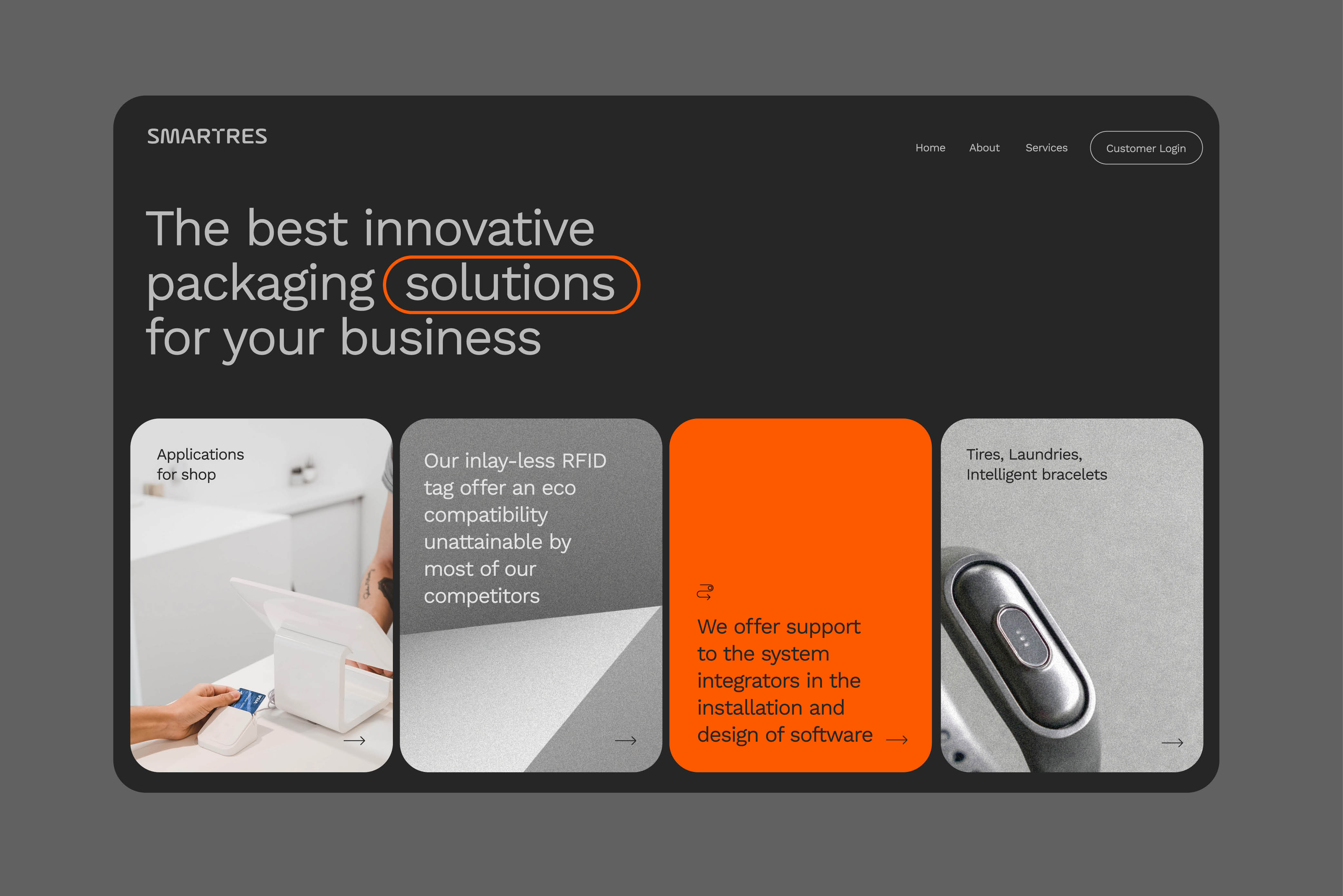
After 15 years of activity, Smartres felt the need for a rebranding of the corporate image, while retaining the official color, orange, reminiscent of the copper wire used in the early RFID models. The new image includes an updated color palette, a new logo, website, and internal corporate communication materials. The identity reflects the brand's values: innovation, dynamism, and authority.
Before developing the new visual identity, a detailed study was conducted on the brand strategy, competitor analysis, target market, company values, and other relevant factors. This phase of in-depth research allowed Smartres to gain a clear understanding of the competitive landscape and customer needs, thereby guiding the rebranding process towards targeted and effective solutions.
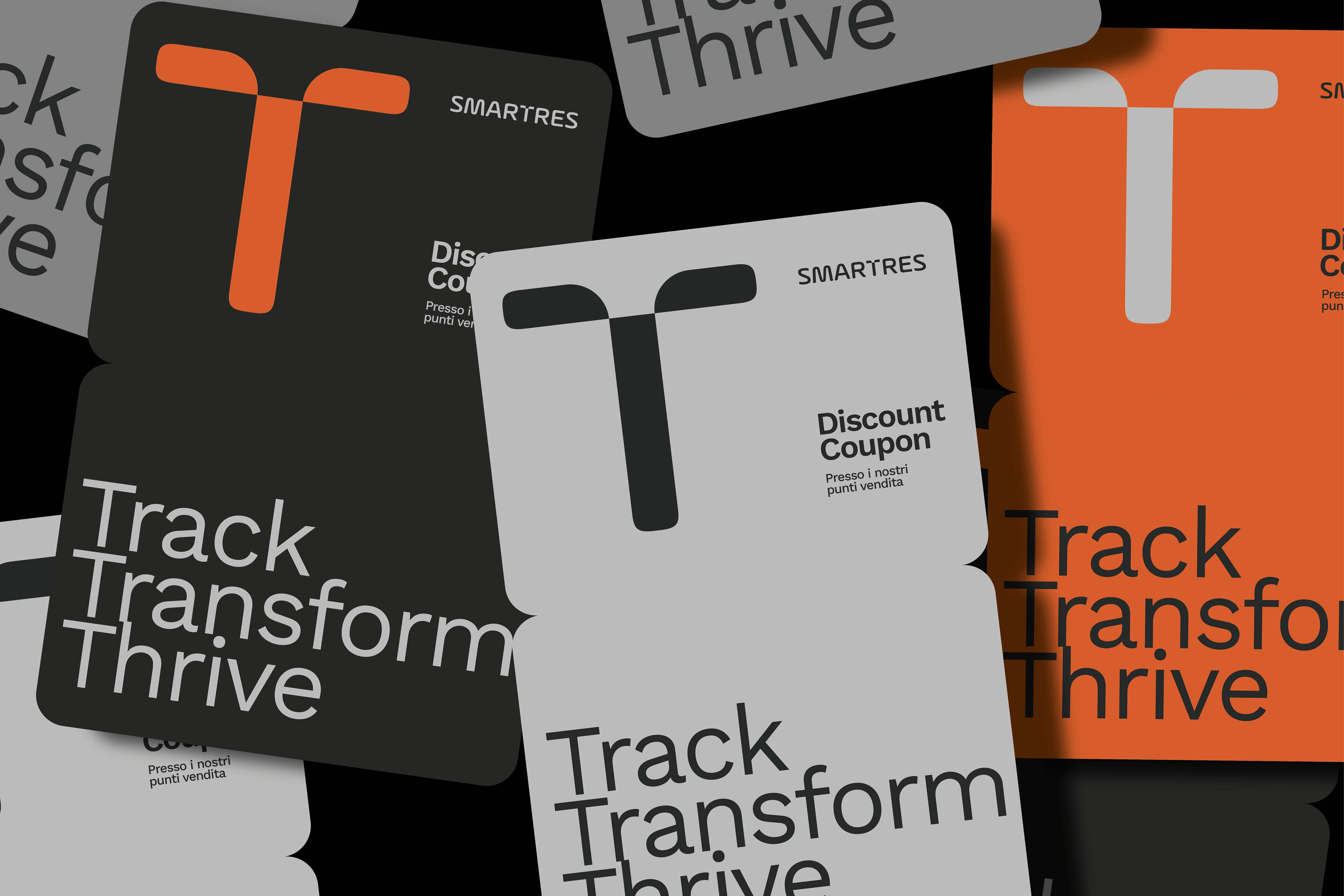
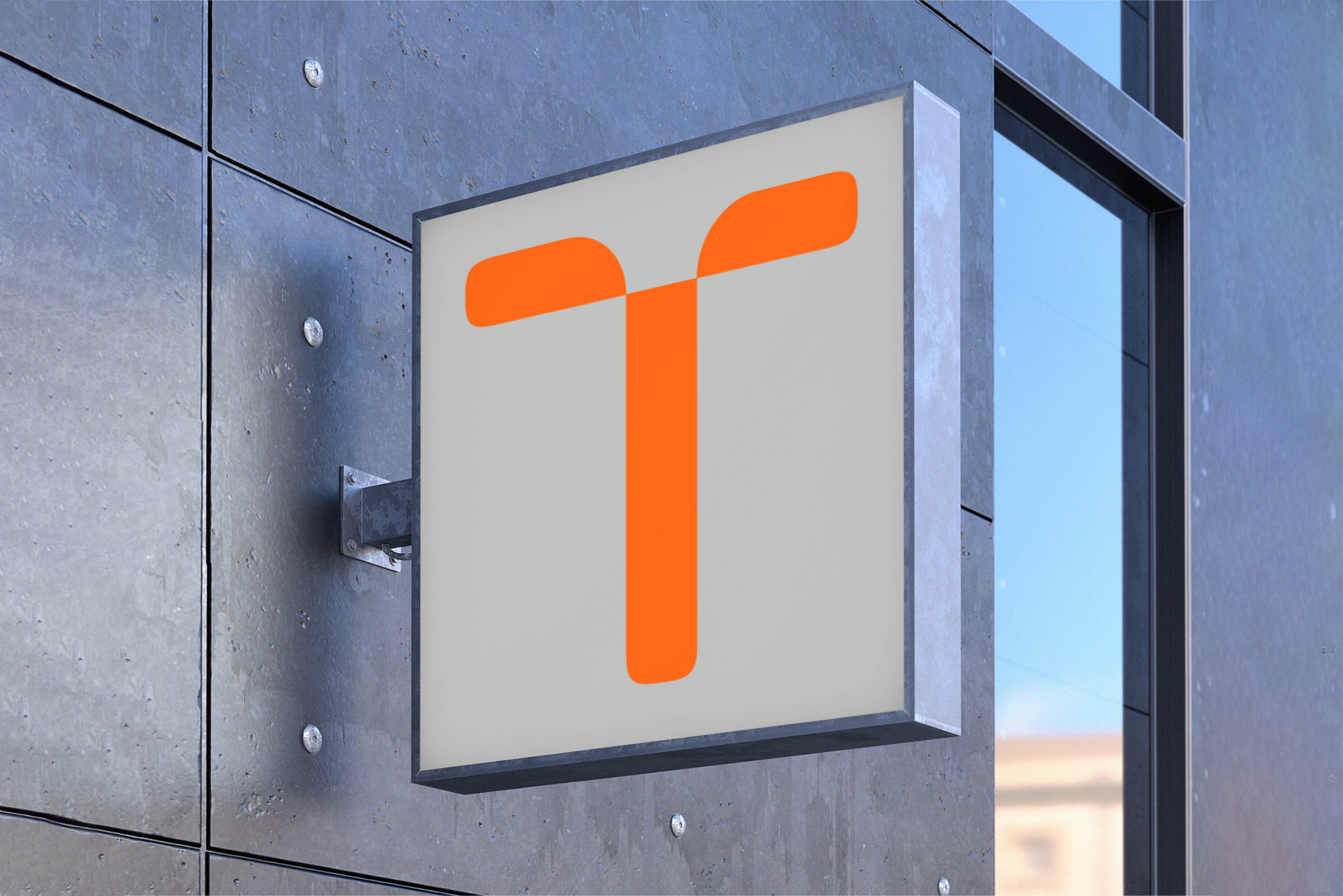
The corporate logo was created based on a modification to the design of the letter T. This letter was chosen both because it serves as a dividing line between the two words that make up the name and because it is the letter that lends itself most to being used as a logo, as it already resembles an antenna.
The chosen color palette is in continuity with the company's historical one and consists of a range of grays and a Pantone orange, much more saturated than the original version and more contemporary.
SCOPE OF WORK
CREATIVE DIRECTION
ART DIRECTION
BRANDING
GRAPHIC DESIGN
WEBDESIGN
CREATIVE DIRECTION
ART DIRECTION
BRANDING
GRAPHIC DESIGN
WEBDESIGN


